So you know how I've been really quiet lately? I have been trying to just let my images do the talking while I worked on a million things like, oh, wedding season, buying and moving into our new house that needs a million things done to it, and all the while revamping my branding and prepping content for my BRAND.NEW.SITE!
You know the phrase, "Labor of Love?" ... well, I'm not sure I truly understood what that meant until now. In February of 2010 I realized that while my business was doubling and my style evolving for the following year my site and portfolio were starting to look a little tired. I was directing potential clients to my blog at all costs, hoping they didn't stumble upon my portfolio full of action-i-fied images that I would not touch with a 10-ft poll these days. I knew it was bad practice to even leave it up but I was in the middle of planning a wedding and you know, life gets crazy! So I turned to my, then fiance (and ever-amazing designer/web programmer), and said, "It's time."
Well, as it turns out, I am not the easiest client- surprise surprise! (A typeA control freak, much?) Show-casing work is so touchy and when you are looking at something that is going to be your first impression to every potential client it's so hard to commit. The control-freak qualities that make me a good business owner did not make it easy for Tim. In fact, at many points along the way, after heated discussions about color palettes, font choices, layout changes, etc. the both of us would sigh, close our eyes, and say, "Okay, tomorrow. We'll do it tomorrow." Tomorrow finally came and things started coming together, piece by piece, month by month and I couldn't be more happy with what we've landed on.
I wanted to share a little bit of the process and inspiration since it was a long self-actualization type of deal. I think it's really important to think about how you want to be represented, who your client is, and how you want your work to make people feel before you start working on a "brand." I strongly believe you have to be yourself before you brand yourself.
All designs by Me + Tim :) (please, please, please, don't steal?)
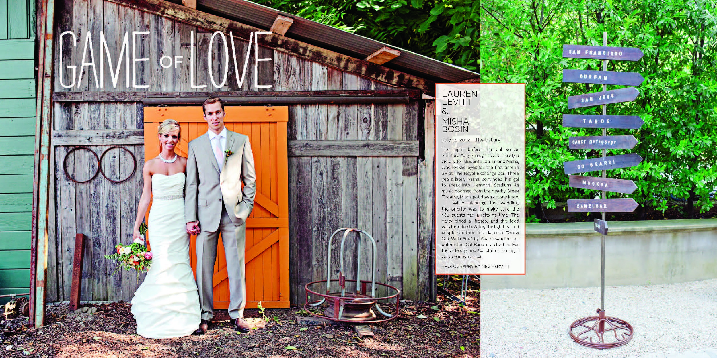
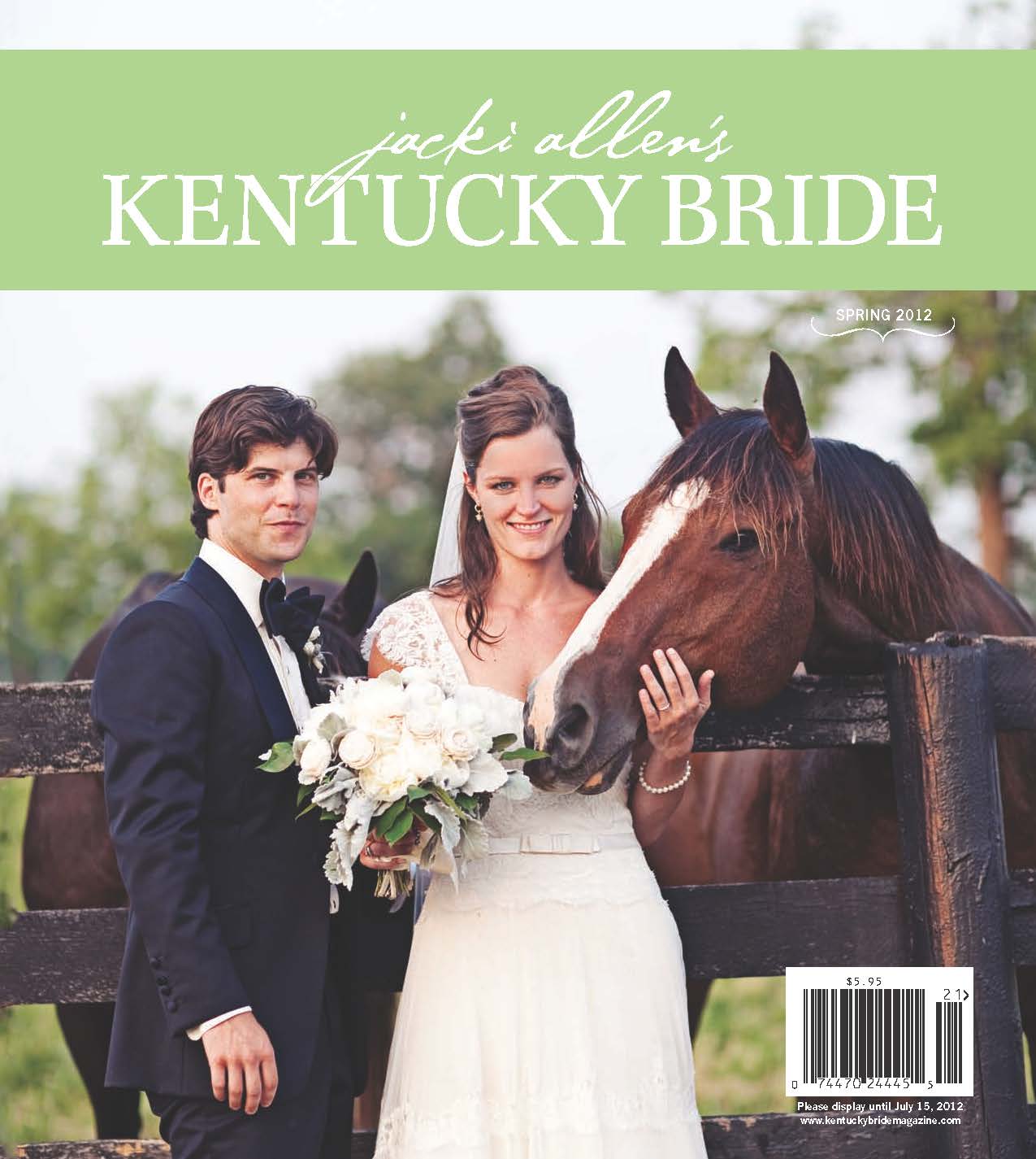
About two years ago I stumbled upon a beautiful poem by the great Rupert Brooke and one passage from it has become the source of inspiration for most of my wedding imagery. It's tacked to my bulletin board in my office and I seriously think of it every time I photograph a new couple to remind myself of how I not only want my clients to feel during their session but also how I want others to view them.
breathless,
we flung us on a windy hill
laughed in the sun
and kissed the lovely grass
-rupert brooke
When I was working on my new pricing "look book" I also developed some copy to further reiterate my feeling about documenting love. I started with this:
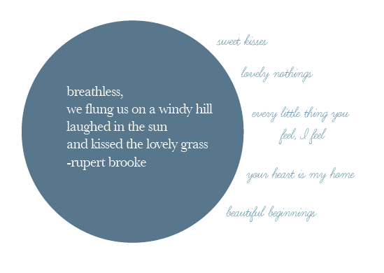 I went even further and started thinking about all of the things that stir something poetic and inspiring inside of me.
I then sat down and thoroughly analyzed myself, my clients, and what I want us to have in common. I'd like to note here that I'm not sure I could have even done this during my first years of business. So those of you just starting out and stressing because everyone keeps telling you how important it is to define your client but you don't even have clients yet? Let that evolve, shoot from your heart, and the right clients will find you. If you build it, they will come. ;) It's so important that my brides and I "get" each other and this was a really important step and ultimately helped shape almost everything that ended up in the final designs.
Some of my favorites:
she could browse paper source for hours / she loves vintage but uses it tastefully and appreciates clean lines and white space | she frequents the flea market and loves raw wood and natural elements | she would live in a white country farm house with white curtains, crown maulding, wrought iron bedframes, hardwood floors that creak in memorable places, a wrap around porch, and a large oak tree with a swing out in the yard if she could| she likes simple pleasures like hot apple pie and the smell of clean laundry | she’d opt for marc jacobs or zac posen over gucci or prada | she travels and while she loves the outdoors she usually finds a comfy bed in a nice hotel or bed and breakfast to sleep in
All of this led to my logo- which I designed ... with input and finishing details by Tim. I am over the curly-cue, fluffy, vintage look and really wanted something clean, modern, yet still classic and not too trendy. Something that could be altered over the years as styles change instead of needing to be completely redone.
Then of course I needed a couple of fun things to use in printed material and here, there, and everywhere so we designed a couple emblems and patterns to give the brand a little personality.
Once the brand details were done we worked hard to solidify the site design and incorporate everything above in an organized easy-to-use not expected or copy catted manner, yet keep the focus on the images NOT me. (After all, the images are what I personally feel should be most important.) I wanted it to be interactive but clean and user-friendly at the same time. Because my blog has been and still is a huge part of what connects me to my brides I wanted everything to tie in together. There are still a few loose ends I need to tie up- facebook pages updates, this blog will get a bit more of a facelift next week, client proofing site updates, etc. but I am so excited to head into 2012 with a much needed rejuvenation!
All in all, this has been major blood, sweat, and tears- and I do not use that phrase lightly. My business is my baby and I am so protective of her! Thank you to the countless amount of friends and family who I asked for advice from along the way and to my ever-loving and patient husband who loves me despite my back on the floor, tears on my cheeks, "will this ever be done?!?!?!?" tantrums. Love you, monkeyface.
Dare I ask.... what do you think? :)

