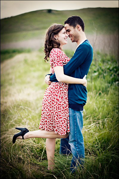
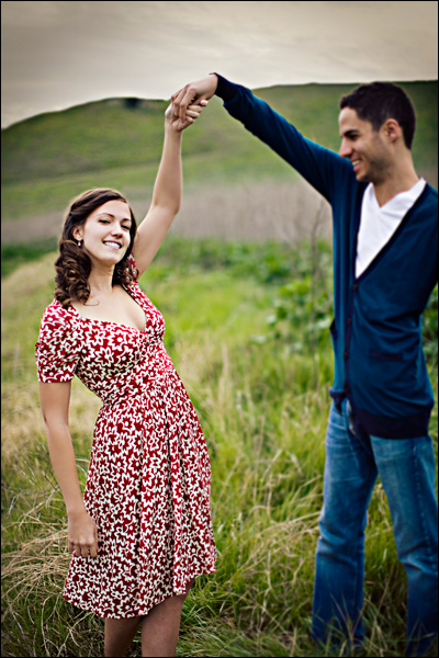
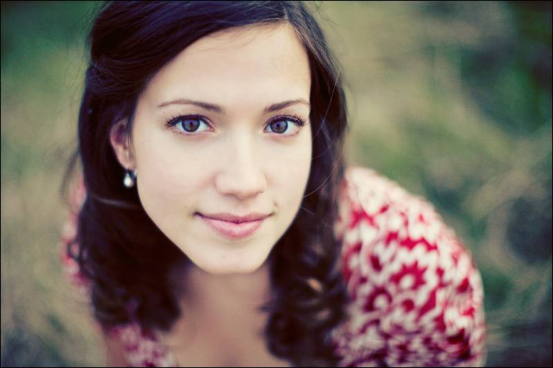
We're baaaack....

Stumbled in late yesterday afternoon, attempted to stay awake as long as possible, ate some welcome home cookies baked by the best cousin ever, fell into bed, and woke today to face the real world. Had a wonderful trip, can't wait to start planning the next one. More pictures to come- we ordered pizza tonight and it couldn't come soon enough!

Tim at the Hill of Tara in Ireland. It was breathtakingly beautiful ... and cold. :)

001.jpg


Before and After Samples

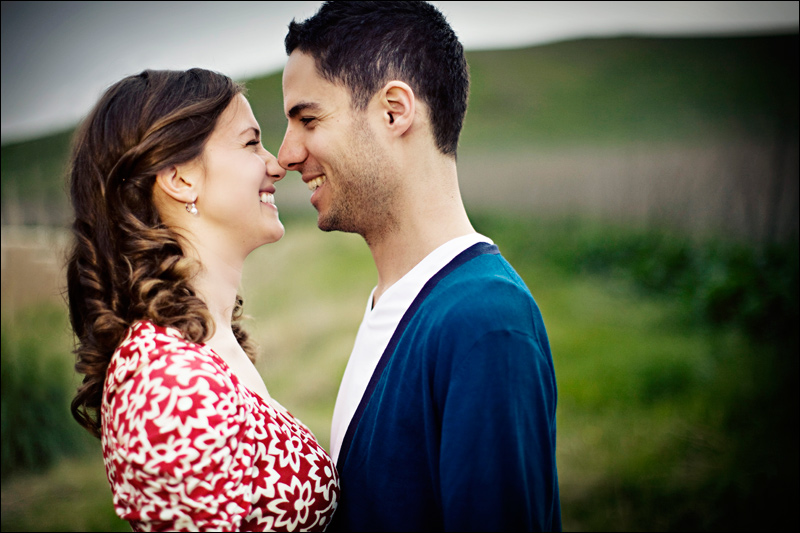
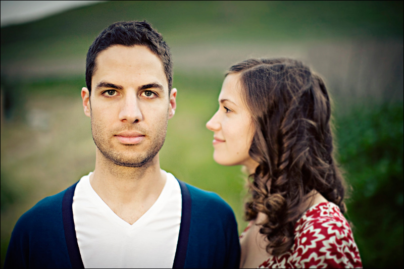
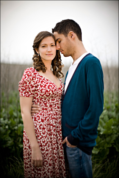
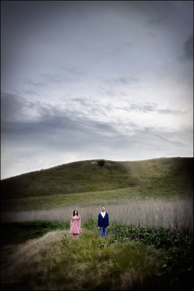
I've been wanting to do a post like this for a long time- and while I'm traversing around London and Ireland I thought I'd throw this up on the blog to tide ya'll over. It's a common misconception that the images we shoot in camera look as good as the images posted on the web galleries or the blog here. The images I shoot in camera look good but I'm not going to lie, I wouldn't say they look great. In general, all images are going to need contrast boosts, saturation help, and sharpening to be ready for print. Even when one shoots film, before an image is printed from a negative or scanned it goes through all of those same processes.

So, I want this post to show you the difference between a good image and a great one. Not all photographers work this way but this type of processing has played a huge part in defining my style-I happen to love manipulating images, playing with color tones, sharpness, and light qualities in post. It's important to understand, as a client, what an image looks like before it's been finished. Also, I always think it's fun to see other photographers before images too so I hope there is a little something in here for everyone!

Before are on the left or the top, depending on the orientation. Don't judge me too harshly- the befores are literally processed raw files, absolutely nothing has been done to them. I toyed with the idea of cheating- doing some general enhancement but in the end- it never hurts to be raw and honest and besides I don't think they look bad at all- just unfinished! ;)

b4001.jpgb4002.jpg


This is a bit more subtle but I think it makes all the difference.


b4003.jpgb4004.jpg


These next two are examples of how I play with color to enhance the general ambiance of the location.


b4005.jpg

b4006.jpg


b4007.jpgb4008.jpg


This is my favorite- while this church is absolutely beautiful inside and out- the lighting is a bit... troublesome. So what do we do? We finish the image, give it some mood some blur some contrast and fix it right up!


b4009.jpgb4010.jpg


Let me know if you enjoyed seeing these- maybe I'll do more of them in the future? xoxo, Gossip Girl... er... Meg


Operation See the World

Tim and I are off to London and Ireland for 11 days. Although my last name is very Italian, my freckles tell you that I am also very very Irish. I'll have a pint for all of you and you can bet I'll be sharing photos upon my return! I am actually not going to bring my laptop and doubt I'll be spending much time in internet cafes so.... if it's an emergency, call my mom, she knows how to reach me. ;) Cheerio!

map_large2.jpg

Happy Birthday, Timmy!

Today is Tim's birthday! I don't know what I would do without him and every year we are together I just feel luckier and luckier. Here's a story- one year, I think it was for our 3rd Anniversary of dating ... Tim's band had signed to Atlantic Records that year and the Grammy party that they had to attend fell on our anniversary date. We had spent a lot a lot a lot of time apart that year and things we're tough. On our way to dinner before the party we were cruising along to Love Songs on the Coast - our local smooth radio station that we love to hate and I hear over the radio, "This song goes out to Meg in Los Angeles... Tim knows you've been through a lot this year.....blah blah..." I lost it! We had been joking about these sappy dedications for 3 years and here I was listening to one for me. This is the kind of man Tim is, he shows love in laughter and he's perfect for me! Happy Birthday, Baby! Who couldn't love that face on the right? Ha!
tim3.jpgtim4.jpg


Kaumyar and Ashley - Anytime Session

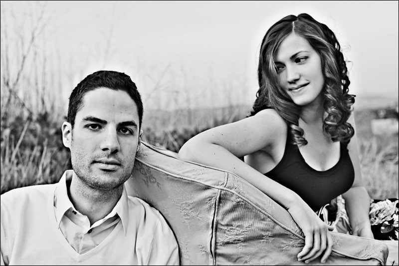
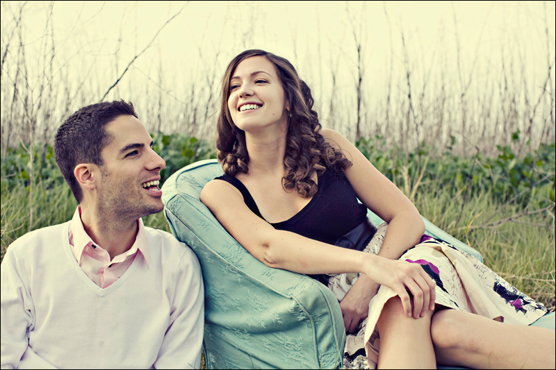
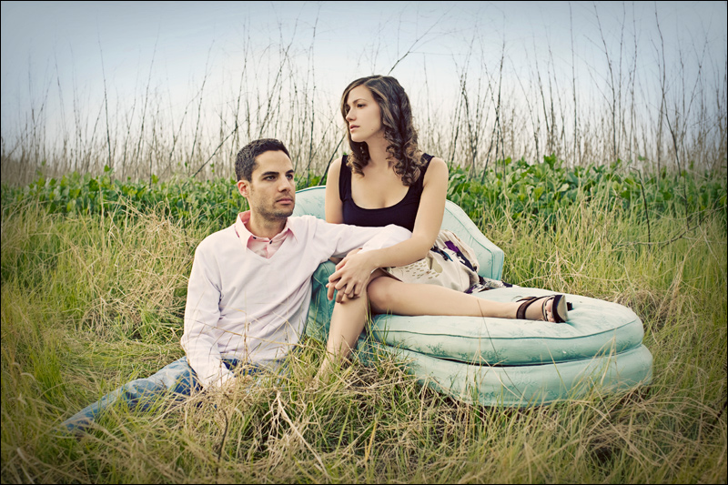
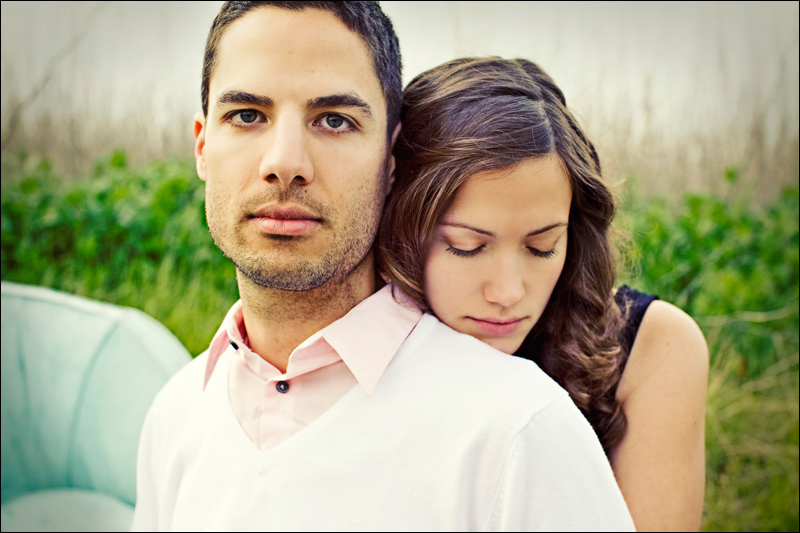
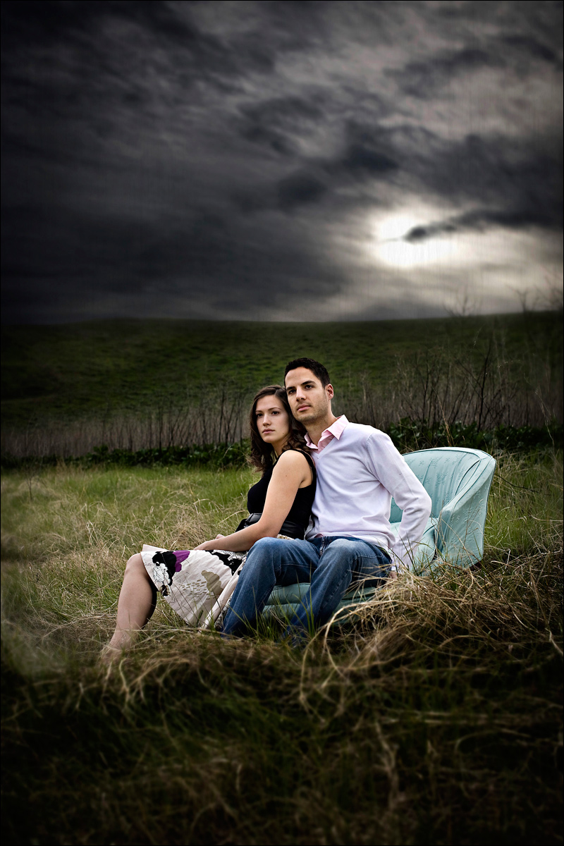
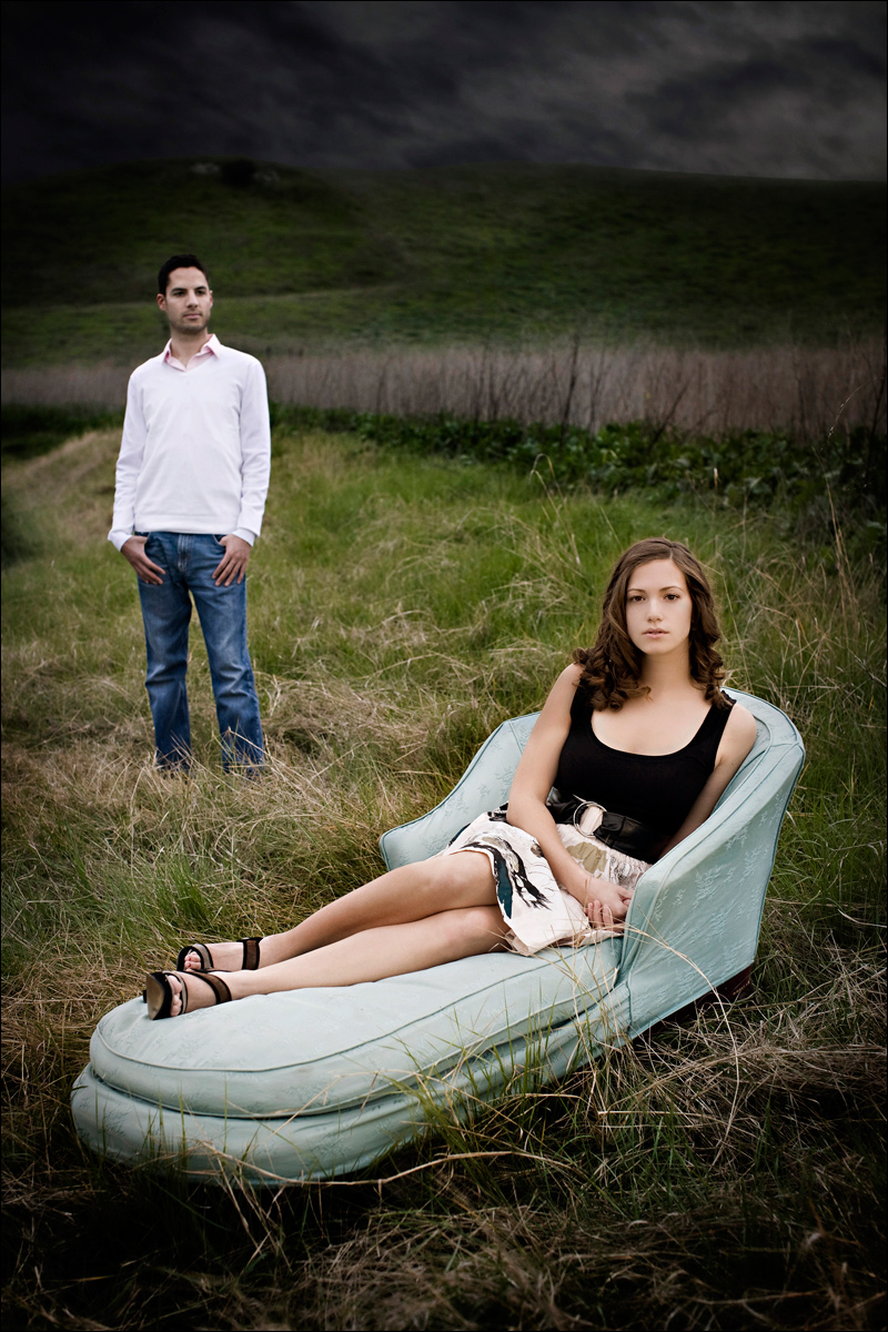
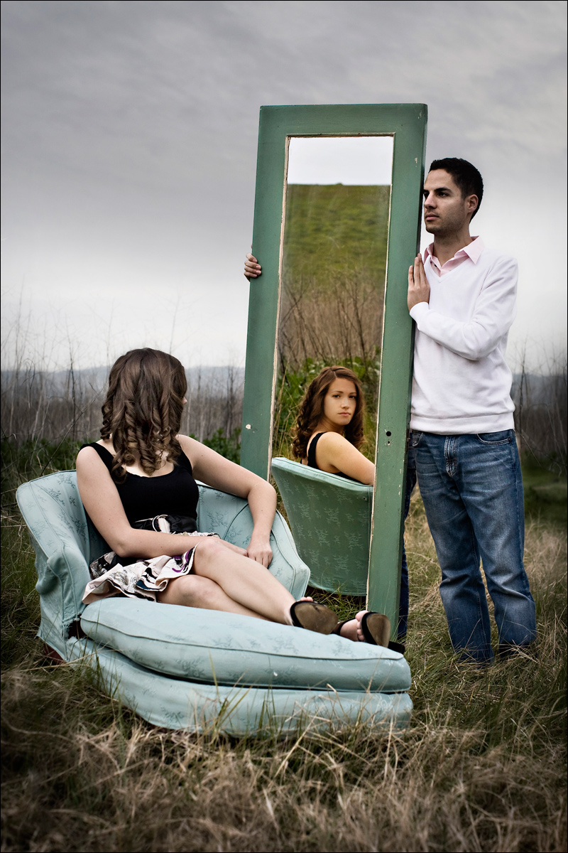
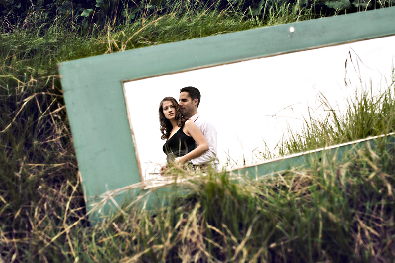
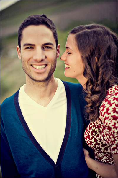
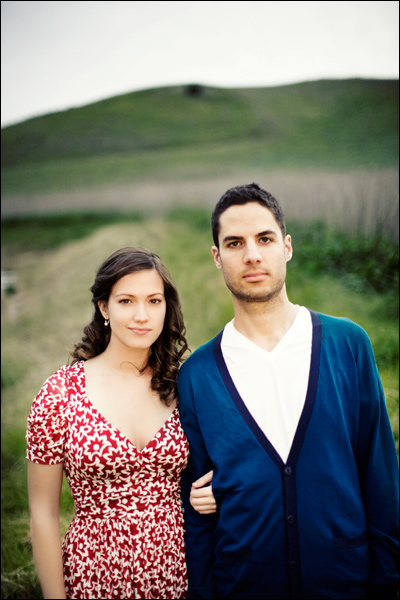
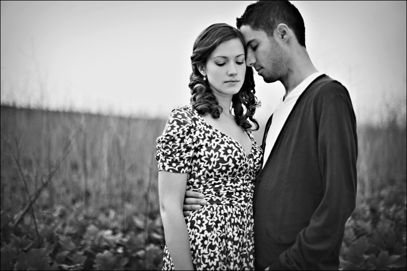
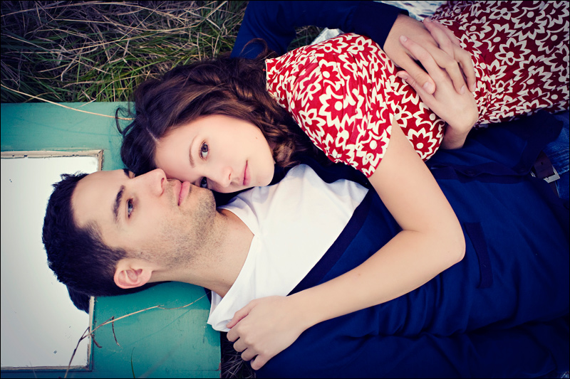
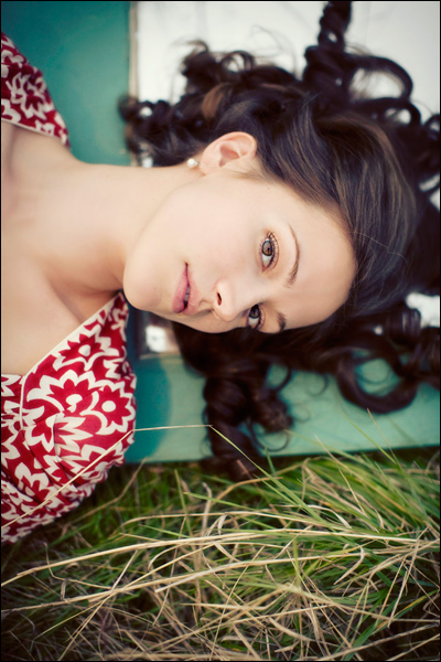
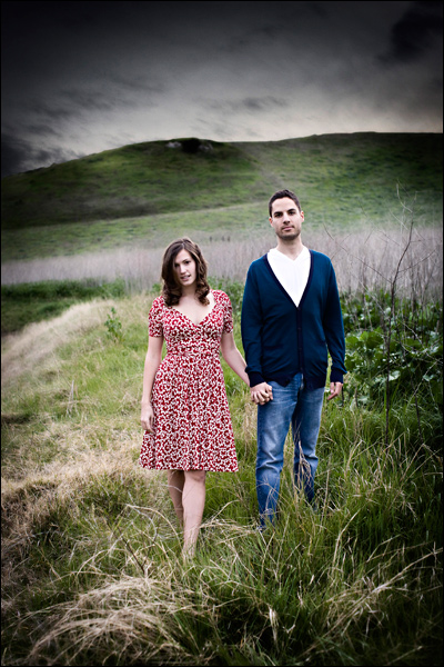
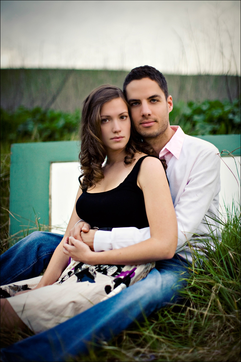
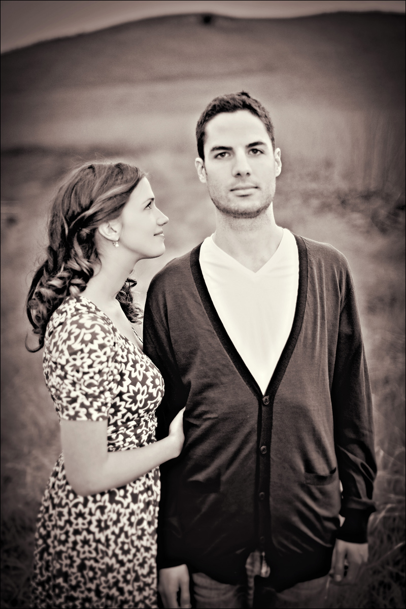
When prospective clients view my website they stay there for an average of about 2.5 minutes before either leaving, bookmarking my site, or filling out a contact form. 2.5 minutes! I have 2.5 minutes to make a big enough impression on someone that they'd consider me to photograph one of the biggest days of their lives! I think one of the most important things in deciding who is going to be your photographer is to find someone who's work and personality you love. Such a large part of what's important about your wedding day is the experience and I wanted to find a way to show my clients a little bit of how their experience with me will be before they even meet me. I want them to walk into my home for a consult and already feel like they know a little bit about who I am and what type of imagery I am really about. So! I had the super great and talented Jeff Conrad direct a short video documenting one of my shoots for my main page. I just wanted something simple and romantic and I think Jeff pulled that off so amazingly well! Here are some of the final images that will end up in that video! (Check out the "HOME" link at the top of the page to view the video.)

One location, available light, + video light when it got darker due to impending rain, one assistant, Canon 5D, 50mm 1.2 lens, and two gorgeous clients!

Onward! (Thanks to Tim for being my grip/lighting/assistant/support for the day and to Gabe for loaning her gorgeous fainting couch!)

0013.jpg

0024.jpg

0032.jpg

0043.jpg

29.jpg

30.jpg

0072.jpg

0081.jpg

0091.jpg

0112.jpg0122.jpg

0102.jpg

0132.jpg

0142.jpg

016.jpg0151.jpg

0171.jpg

018.jpg

019.jpg27.jpg

021.jpg022.jpg

023.jpg